Phoenix Fitness
Brand & Website Design
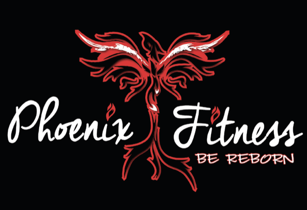
The Phoenix Fitness branding was very important to my client, she wanted it to attract both Men and Women as she felt that sometimes women were intimidated by the whole fitness industry and with themselves being labelled as strong. My client wanted a Phoenix due to trials in own life that she had had to build herself back up from and this was her new start but she also wanted to help others be happy being strong. She wanted them to be the best they could be rather than focusing on what celebrities look like in airbrushed photos.
Firstly we tried out a range of colours but felt blues and greens were too masculine so orange, red or yellow would be used as the highlight colour contrasted against black to make the colour pop. Red was chosen as the final colour due to appealing to both men and women equally. Various phoenix images were drawn but the final one needed to be a strong image so I used the red outline and just touches of white picking out details. I made a wing on each side softer and in white so it stands out too.
The font was chosen to be a lot softer and against the harder red image of the phoenix, it would appeal to both sexes.
The customer was very happy with the final branding and when printed on t-shirts and hoodies it really stands out which she loves.
To get your Leicester website contact us now on www.purplepatchdesign.co.uk.
Personal Trainer